

Water for Food Branding Update
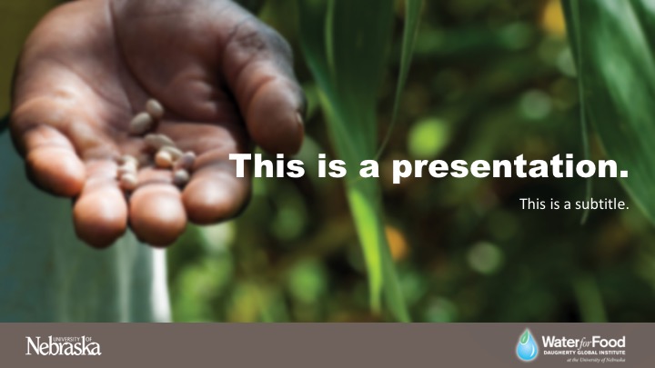
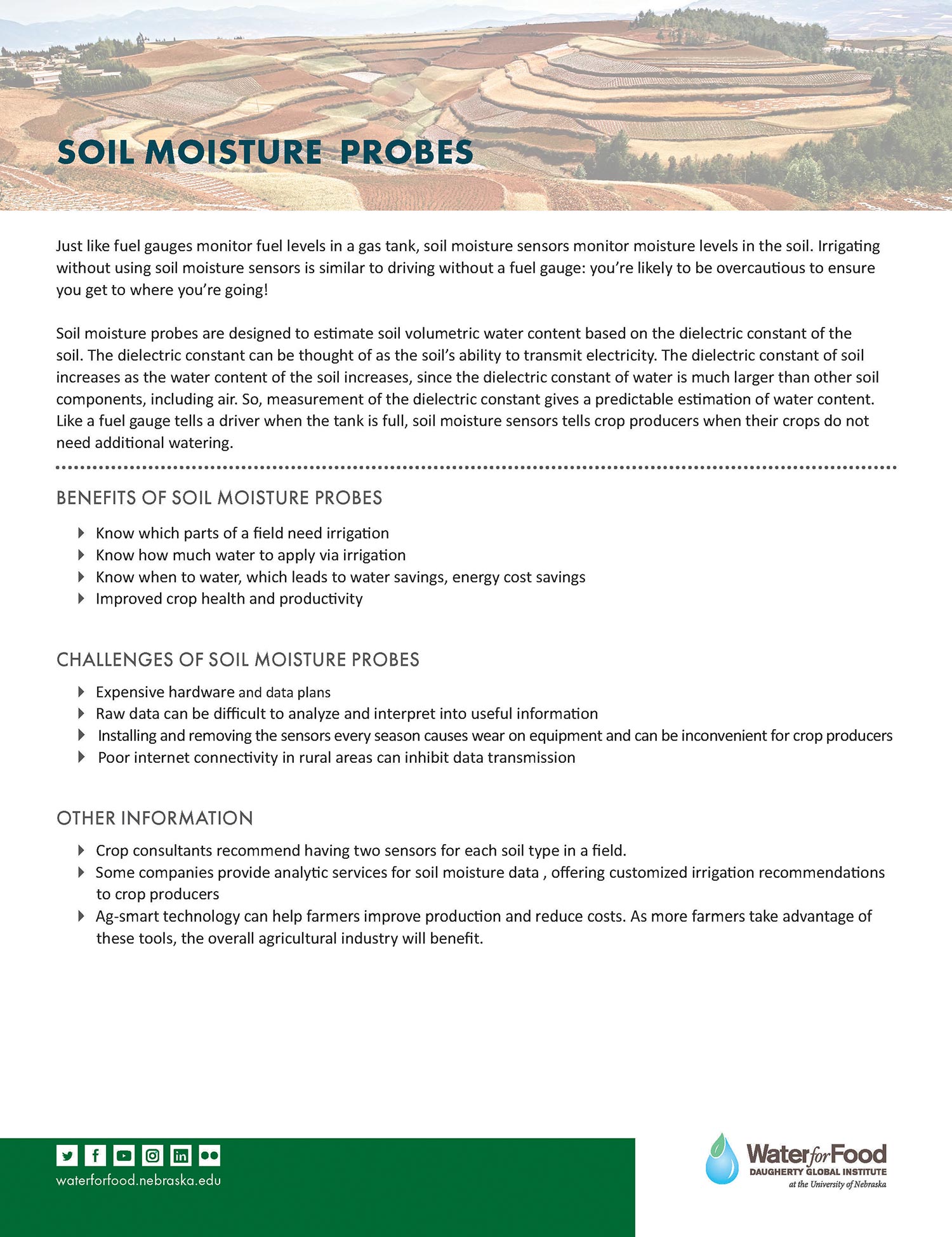
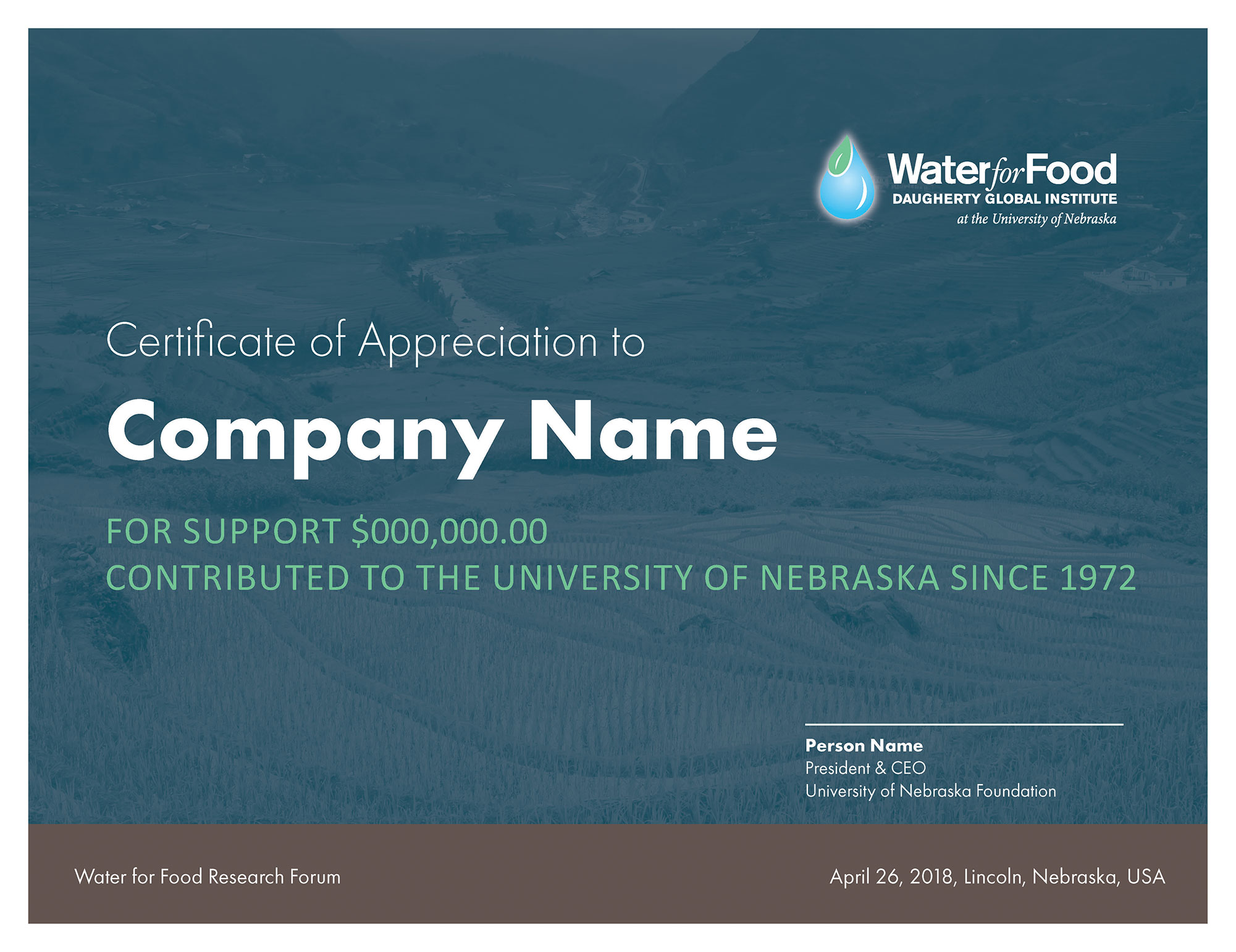
The Daugherty Water for Food Institute (DWFI) has maintained a style guide which includes logos, fonts and colors to use within communications materials for the organization. I updated the style guide in 2017 to reflect some of the changes that happened since the creation of the organization. Working closely with the University of Nebraska central administration, our visual branding was changed slightly to better align with the University of Nebraska’s branding and style guide. This included bringing some of the colors and fonts from the University of Nebraska’s branding into DWFI’s existing visual branding.
The difficulty of this project was to determine which components to keep from our existing branding, while bringing in the new elements in such a way that everything would match and work together. Some of our existing colors were tweaked slightly so that all the colors would work together. The logo was also slightly changed to bring in a different shade of green. Our previous branding had included many bright colors based on countries where we are doing research. The secondary colors were reduced with the final outcome to be using the primary colors more prominently. The colors were also selected with WCAG AA compliance in mind, and the usage of compatible colors for the web were outlined within the style guide.